Easy DIY Textured Wall Art Tutorial
Turn a found frame and leftover materials into high-end textured wall art. This easy DIY project uses joint compound, paint, and a drop cloth to create a modern, sculptural look on a budget.
DIY Textured Wall Art Using a Salvaged Frame and Drop Cloth
Sometimes the best DIYs start with a lucky find. I saw this frame on the sidewalk during a walk with my boyfriend and immediately claimed it. The glass was shattered, but the frame itself was perfect — and my very obliging boyfriend carried it the whole way home while I brainstormed what I was “definitely” going to do with it someday.

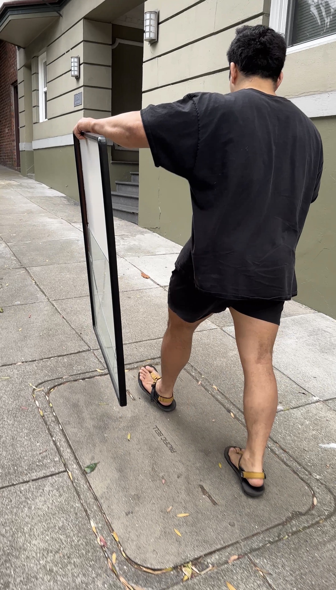
I tossed the broken glass, cleaned it up, and saved it for the perfect project. That project ended up being this sculptural, minimalist textured art piece made from materials I mostly already had on hand! Here’s the full step-by-step tutorial.
Materials You’ll Need
Old frame (mine came with a mat)
Palette knife (I got this set)
Pencil and tape measure
Quart-size ziplock bag
Step 1: Prep the Frame
Start by removing the mat, glass, etc from your frame. Wipe down the frame and make sure the backing is smooth and clean.
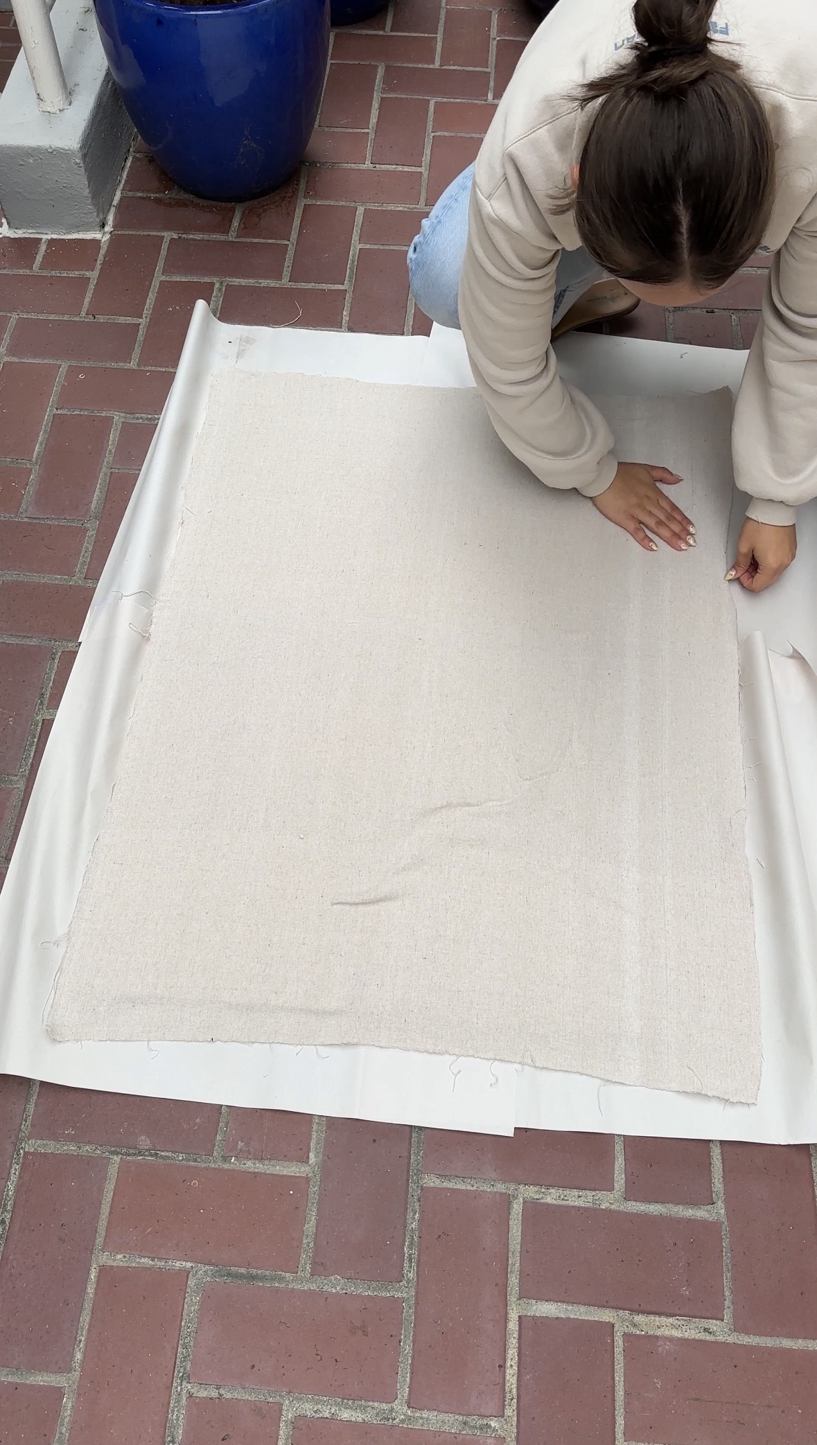
Step 2: Create Your Canvas Surface
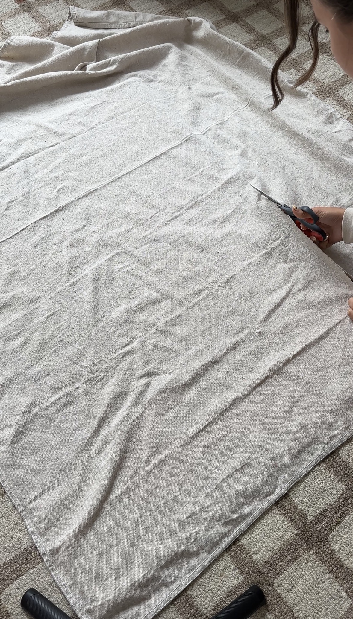
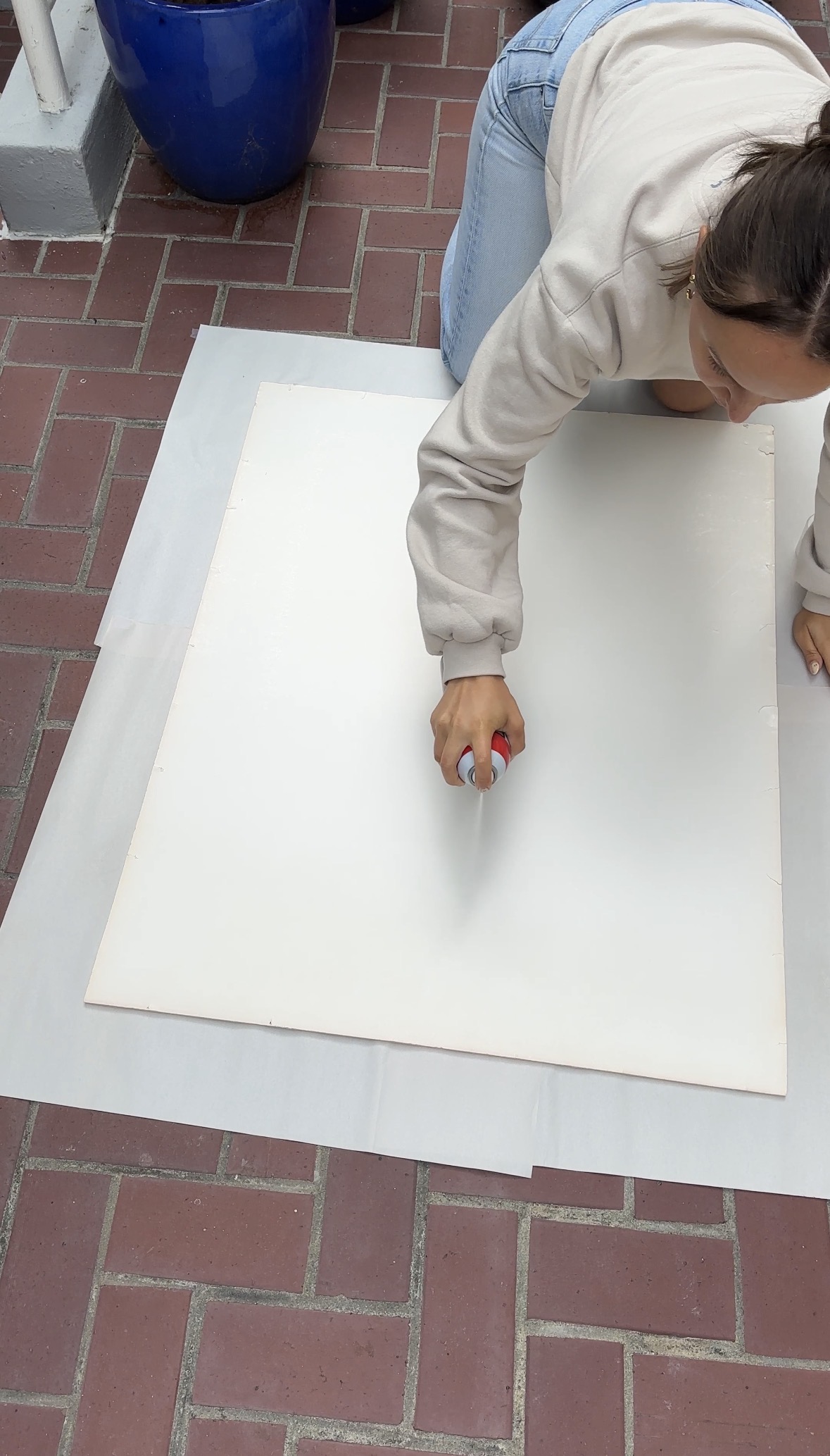
Since real canvases can get expensive (and wouldn’t fit my frame anyway), I cut a section from a canvas drop cloth and glued it directly to the face of the mat using spray adhesive. Once it was smoothed out, it created the perfect surface to paint and texture on.
✨ A Little Pinterest Inspiration
I actually got the idea for this piece while scrolling through Pinterest — I’ve been collecting ideas for a colorful DIY gallery wall, and I love how textured art adds variety next to painted and framed pieces.
If you want to see what inspired this one (or save ideas for your own wall), check out my Pinterest art inspo board here — it’s full of modern, colorful DIY art ideas that are easy to recreate.
Step 3: Mark the Design Area
I wanted a 3.5" border around my design, so I taped each edge to visualize the border and keep my pattern centered.
Then I drew a light pencil line straight down the middle — that would be my guide for where each first “ball” of texture would go.
Step 4: Mix the Texture Medium
To make my own texture paste, I combined:
44 oz joint compound
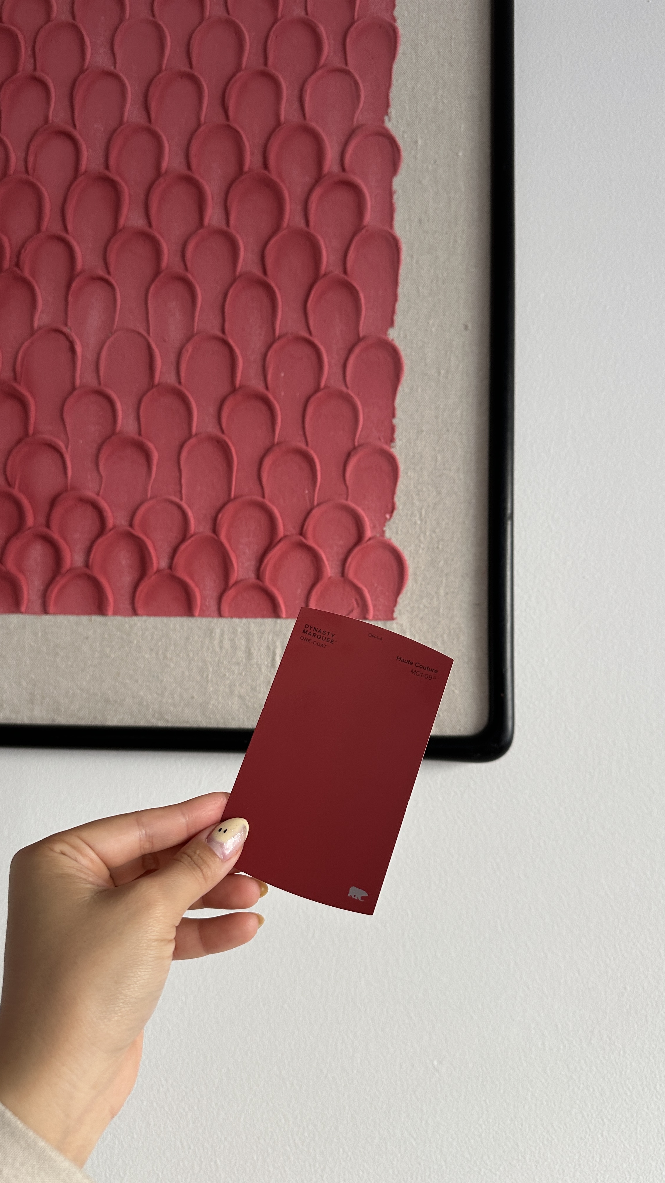
4 oz interior paint (I'm using Haute Couture by Behr)
2 oz glue
I mixed it thoroughly until it was smooth. This makes quite a bit, so make it in increments if you need to! I ended up needing more joint compound than expected, so I split it into two batches.

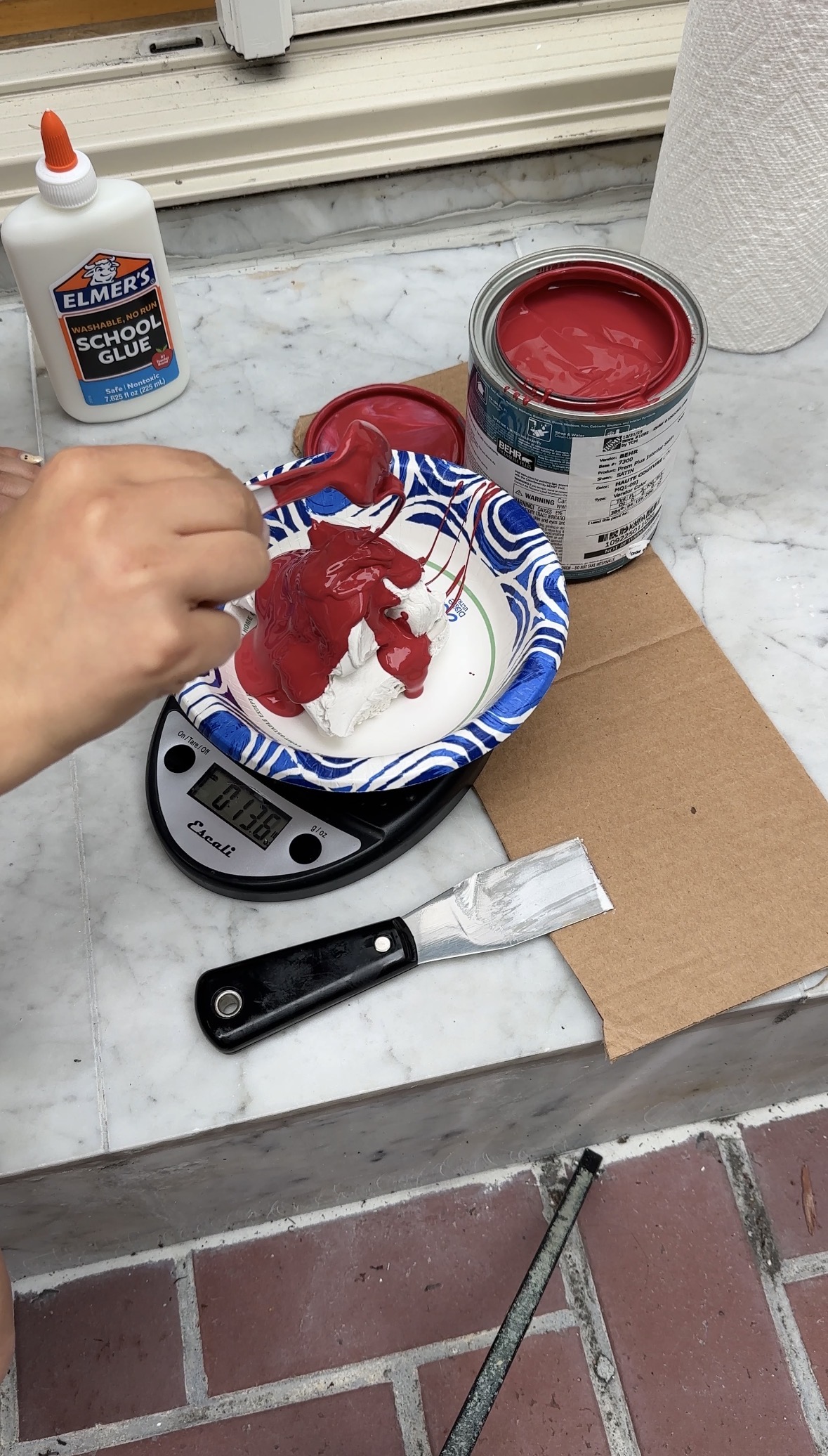
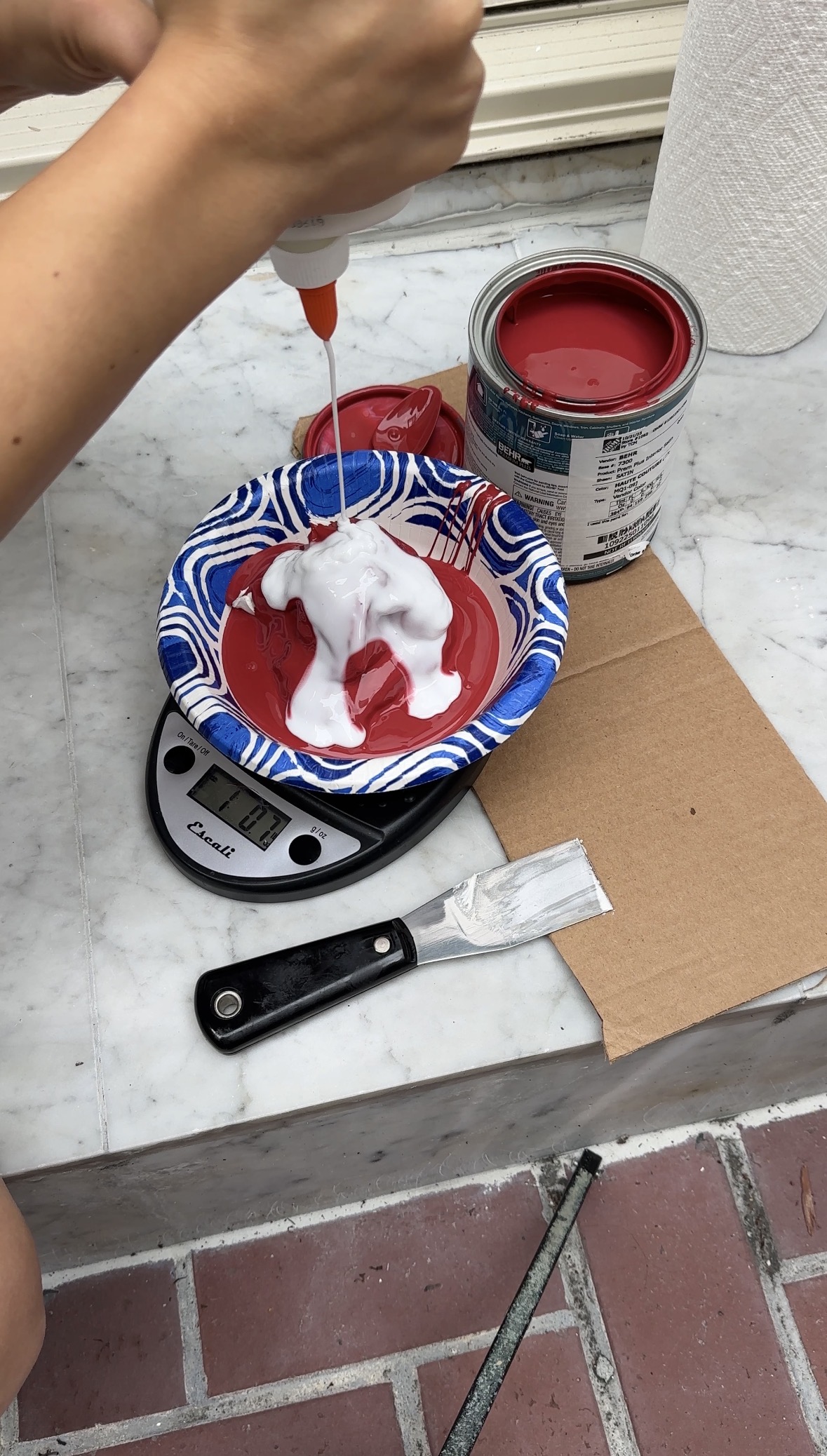
Pro Tip: The paint color will dry much lighter when mixed into joint compound, so start with a darker shade than you think to achieve your intended color once it’s dry. Ask me how I know...
Step 5: Apply the Texture
I transferred the mixture into a quart-size ziplock bag and snipped the corner to create a piping bag. Using my pencil line as a starting guide, I piped small “balls” of the mixture in staggered rows, one row at a time and spread each one gently with a large palette knife before piping and spreading the next row.
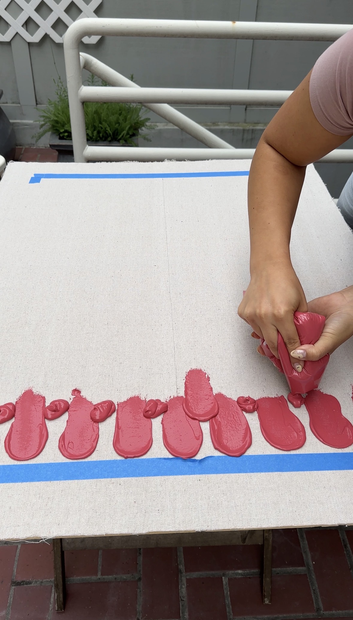
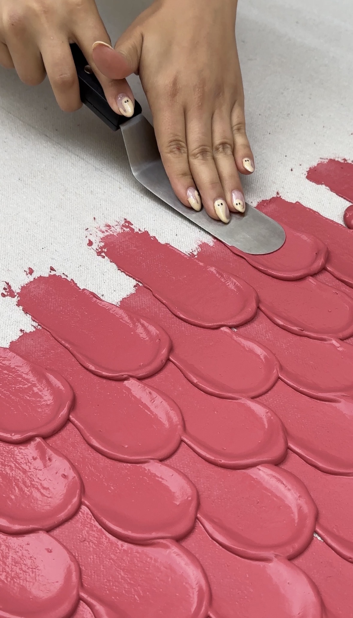
Pro Tip: Practice on scrap material first to get your spacing and technique right — it helps to find your rhythm before working on the actual piece.
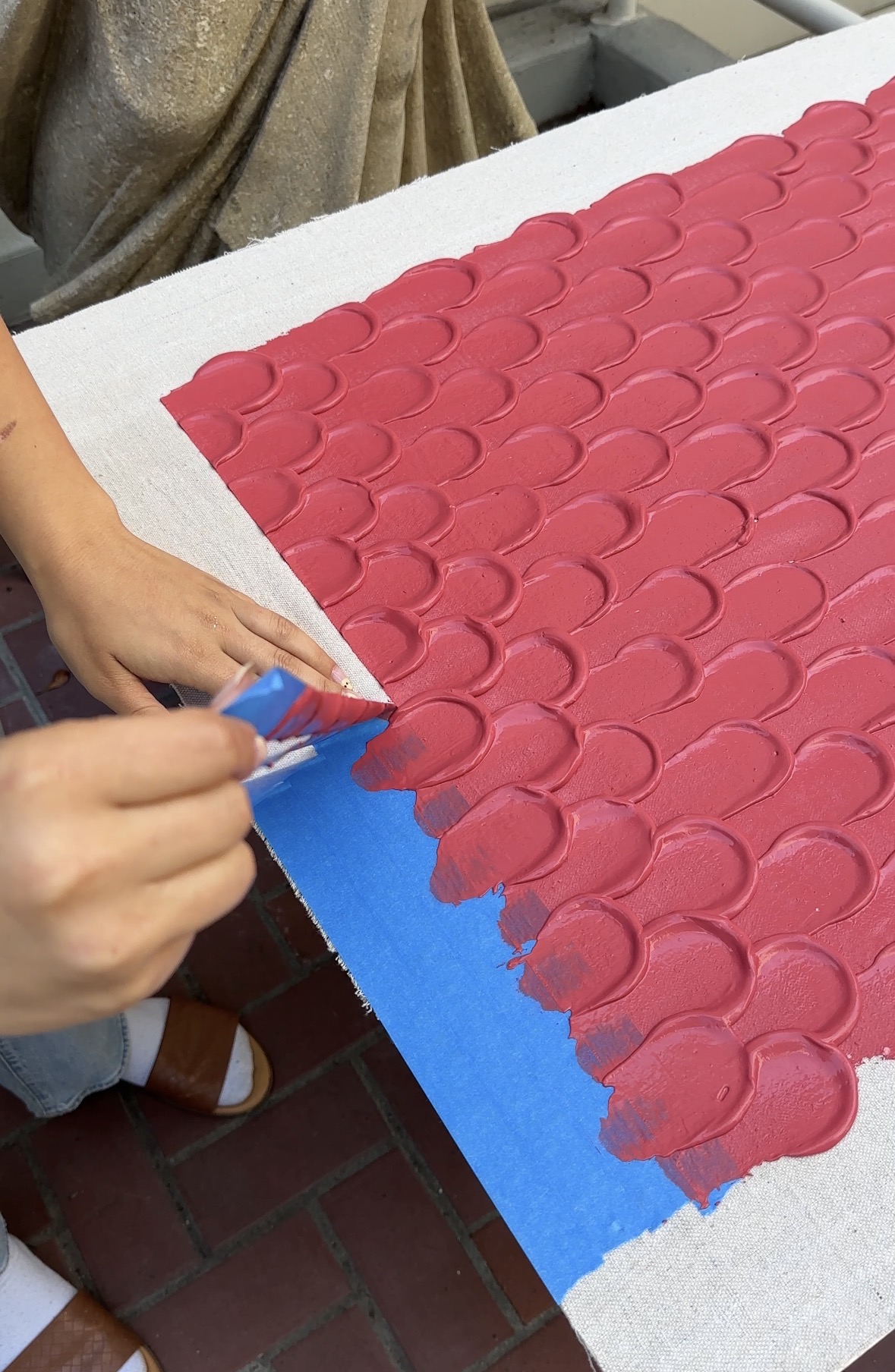
Step 6: Peel the Tape for a Clean Border
Once I reached the bottom, I carefully peeled off the painter’s tape to reveal a crisp, clean edge. Take your time and avoid letting any wet compound touch the exposed canvas as you peel.
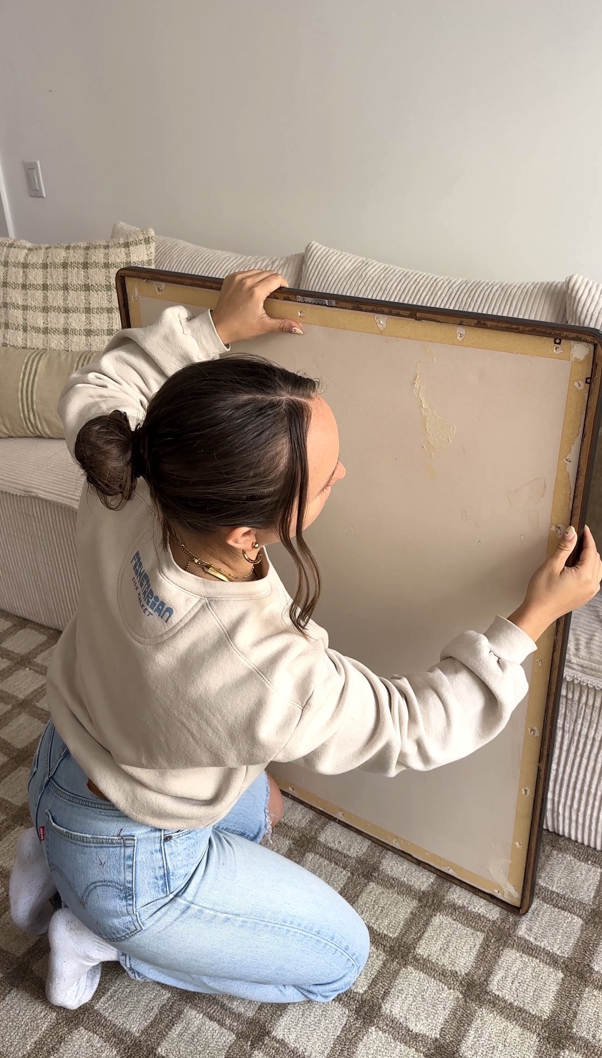
Step 7: Let It Dry & Frame It
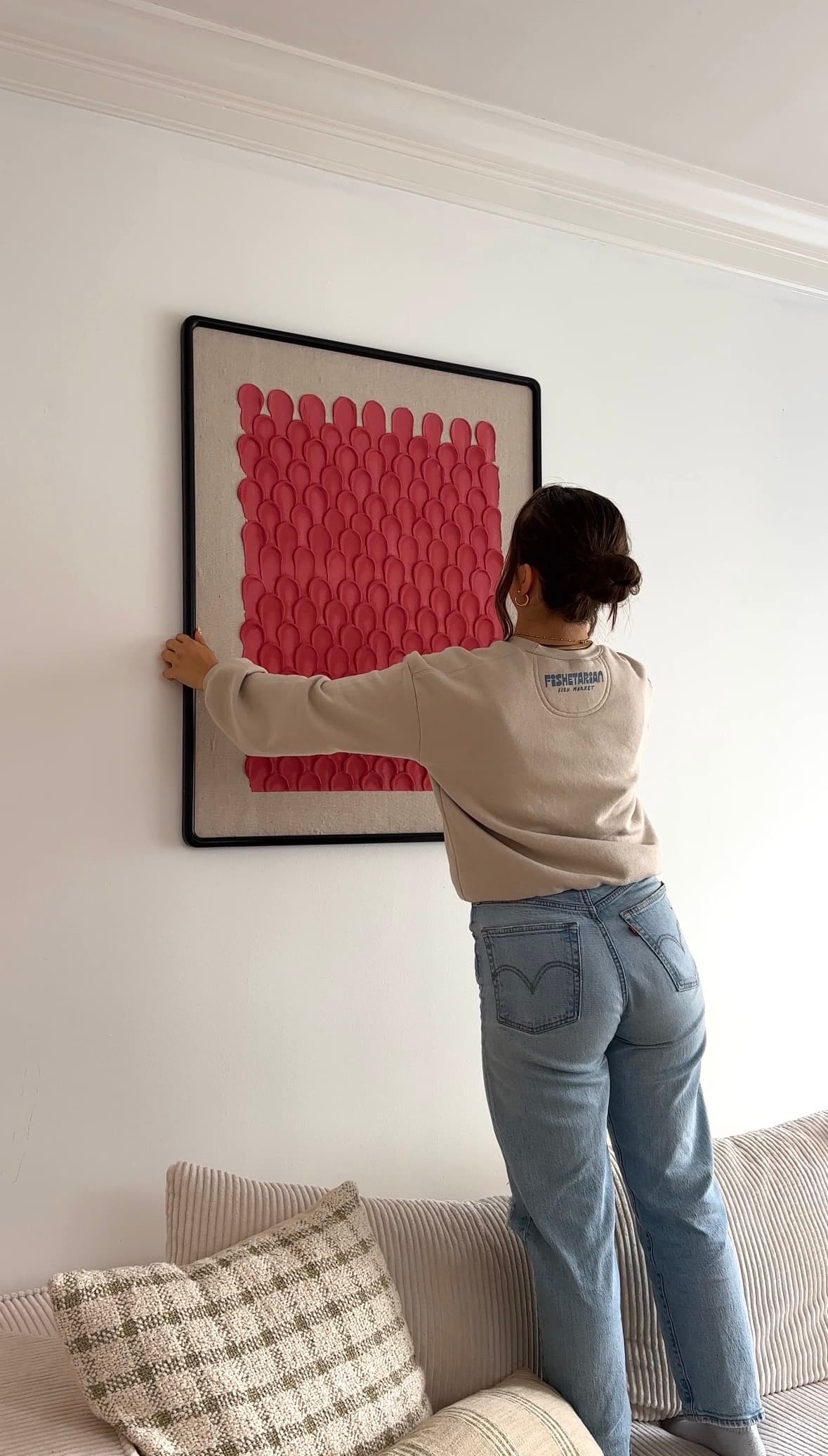
Once the texture was completely dry, I clipped the mat back into the frame, secured everything in place, and hung it on the wall. No glass needed — the dimensional surface looks best exposed. It’s simple, modern, and adds that perfect bit of handmade character to my space!

Final Thoughts
This DIY is a perfect weekend project if you want to create art that looks expensive without the price tag. You can experiment with colors, shapes, or even layer textures for a more sculptural effect.
Quick Tips:
Go darker with paint for richer color after drying.
Practice piping before committing to your final piece.
Don’t stress about imperfections — they add character!
The color I ended up with has this deep pink tone, which wasn’t my original plan — the red paint I mixed in lightened way more than I expected once blended with the joint compound. It’s still pretty, just not quite the deep red I had in mind. So now I’m debating whether to paint over just the textured design (and maybe the frame too) in that original red for a bold, monochrome look. The black frame works, but I don’t have much black in my space.
What do you think — keep the unexpected pink, or go all-in with the red?
Looking for more DIY wall decor ideas? Check out my $10 DIY picture frames tutorial for another easy, high-end looking project you can make on a budget.
📌 Don’t forget to pin this DIY textured art tutorial so you can try it for your next art project!